The Bucs played it safe with a modest reboot of their look from the Jon Gruden era. They should have leaned into it and taken a big swing.
It would seem that lately, NFL uniforms have followed the same cycle we see in the yearly release of items like new cars, cell phones, sports video games or contemporary menswear. Relentless overpromotion leads to the eventual realization of the truth that the new version is just slightly different from something you were already content and familiar with.
In releasing their new look Tuesday, the Buccaneers had the built-in advantage of immediate fanfare. Whatever they had demoed to the audience would be an instant improvement over the bad acid trip that was their uniforms over the past few seasons—unquestionably the worst in professional football. However, when they released the hype video unveiling its replacement, the immediate reaction to many was, Hey, aren’t these just the ones they wore before the ugly ones?
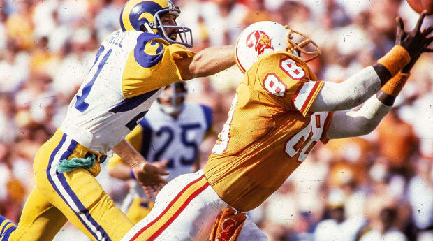
This was a situation clamoring for the old creamsicle Buccaneers look. I cannot be alone in believing that, in this era of unprecedented polarization, the orange and white getup worn between 1976 and 1996 was the type of gimmick that could have connected us together. The Buccaneers’ creamsicle uniforms were a perfect flashpoint in NFL history; retroactively hideous but, under a contemporary lens, perfectly, situationally ridiculous. It would be the football equivalent of the live-action Little Mermaid remake on ABC (starring Shaggy!), or the new Sonic the Hedgehog movie. It was something we had no idea we needed but, in hindsight, are glad to have in our lives.
Nostalgia hits are big because they work. I spend an unorthodox amount of time reacquiring the old video game systems and cartridges I threw out or sold when I was in high school. I watch YouTube videos of people opening baseball and Pokemon cards. The Buccaneers’ creamsicle uniforms rise to that level of elemental childhood memory fuel, much more so than the muted red and pewter remake that defined the Jon Gruden era, which formed the basis of Tuesday’s reveal.
Imagine Tom Brady taking the field in those old uniforms; an orange that looks more like a broken hollandaise sauce contrasted with the bleach white helmet and pants. Imagine the Kangol hats Bruce Arians could pair with the whole ensemble. Imagine their rookie first-round pick, whomever that might be, showing up to his first non-virtual press conference in an orange blazer and red tie.
If the Buccaneers wanted to follow the Miami Heat blueprint after acquiring the best quarterback in modern NFL history, they needed to take a massive swing. They needed to ooze Tampa nearly to the point of comedy.
What we got instead was…fine. It was iPhone 9.5 (now with a text message noise that makes a ding! instead of a woosh! when you send it!). It was the new J. Crew catalogue, with the small checkered red and navy blue plaid shirt and the red just slightly less red from the year before. It was a missed opportunity to heal a nation that is running out of things to agree on, save for, of course, our love of the old orange and white jerseys.
• Question or comment? Email us at talkback@themmqb.com.


